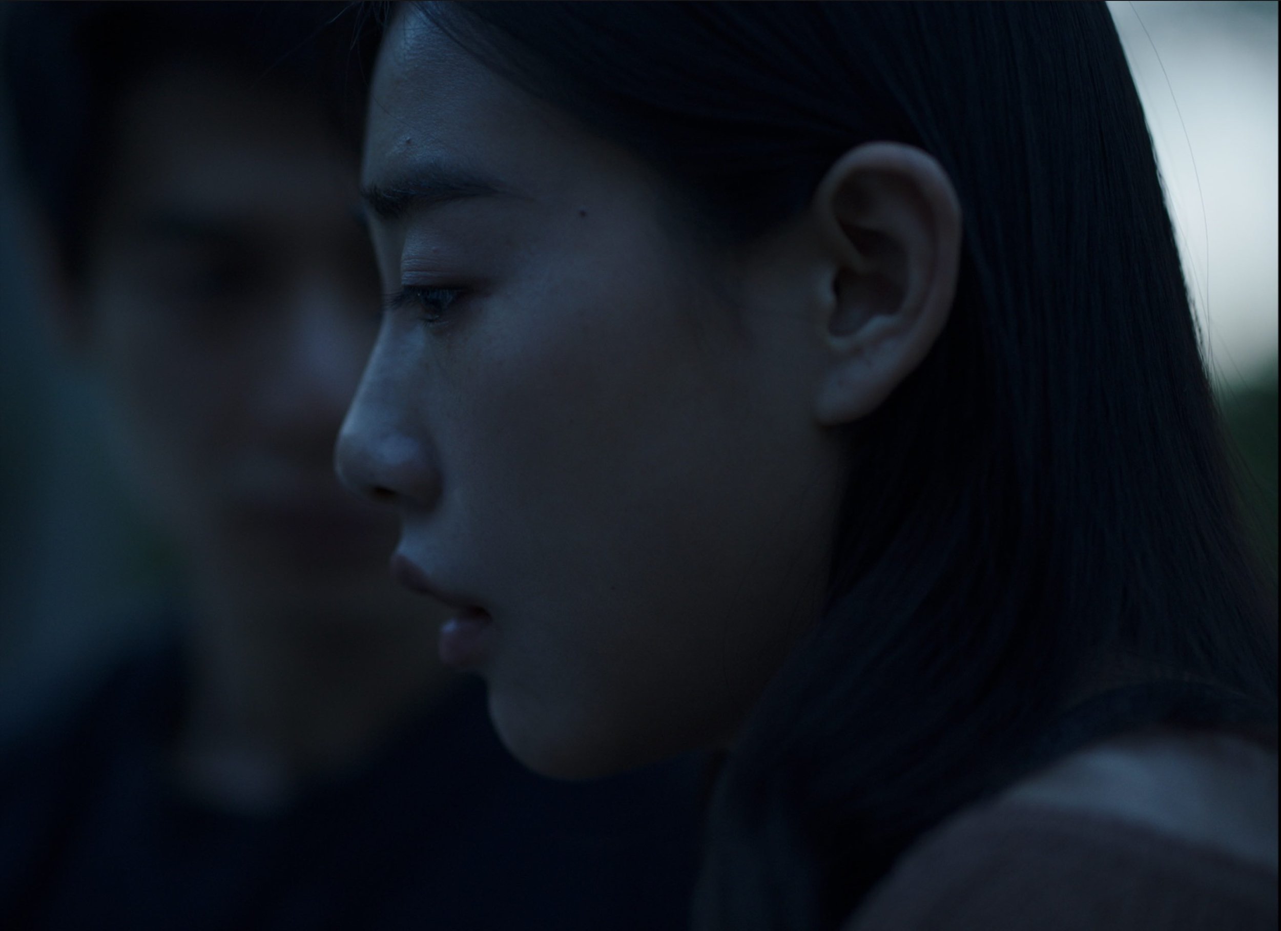
The Visual Style Of GUIDANCE
EXCERPTS of a Film Review published by “Movies Forever” - TRANSLATED from the original Chinese published on 11.10.2021
In GUIDANCE, the Director, Neysan Sobhani and Cinematographer, Saba Mazloum, demonstrate a control uncommon today, largely avoiding quick cuts and fast edits. The visual choices were difficult artistic choices because it moves the film from a commercial look into a more unique category. Being an independent project from start to finish gave the first time feature Director and the cinematographer the freedom to execute their vision. One aspect is the use of long shots designed at key sequences…
……..
But the use of long shots tells only half the story because the filmmakers were still able to achieve effective closeups at precise moments because of a well-chosen cinematic tool: 4:3 framing -- shot with the Arri LF 4.5k chosen specifically for the framing of all 4:3 shots. So, in a rare decision the film uses two frame sizes, not just only the traditional 2.39 widescreen framing, which in this case was shot with the Red Ranger 8K Monstro.
……..
So why choose two aspect ratios? In an article by Kelly Conaboy, Rian Orso, professor at Oberlin notes: “4:3 allows for more intimate portraiture” which director Andrea Arnold has said allows for a “very respectful framing because when I look at somebody in a 4:3 frame it makes them really important. They’re not small in the middle of something… It’s a very human frame”.
……..
Sobhani has stated similarly that “the 4:3 frame size forces us to see the couple closer together- and by that I mean literally physically closer so that they fit in the frame. This helps us feel their emotional closeness which could not be emphasized using a widescreen format. But, ironically, underneath this facade of closeness we notice in the minutiae of their behavior a wide distance due to distrust. But also the 4:3 framing masks a surface closeness but is ultimately subversive for the audience. On the other hand, using a widescreen frame with the ex-couple amplifies the physical distance of their relationship, helping reinforce their emotional distance.”
……..
The mesmerizing still shots in 4:3 also reminds of the style made more popular by Paweł Pawlikowski in IDA and COLD WAR. The key point is that put all together, these shots and techniques puts the audience on notice that although this is a film set in the future, it is highly ground in the past in terms of its visual approach.
……..
An additional note on color. There is a subtlety and detail that is differentiated in each of the locations. The Cinematographer, who had worked with Zhang Yi Mou, Stephen Chow, Dai Si Jie and Xu Ke, has stated how he always found the paintings of Caravaggio for lighting inspiration. Certainly, the entirety of the scenes in the safe room, where the Director gave full freedom to go as dim and contrasting a look as possible, take cues from the candlelit or natural lit paintings of Caravaggio.
